A 106-year-old Chattanooga landmark, which played a significant role in the city’s identity, was undergoing a face-changing renovation. The Choo Choo, Chattanooga’s former rail terminal, now a famous hotel, was legend—an identity known far and wide. The challenge was taking the best of the old and the new and bringing them together in a way that celebrated the Choo Choo’s historic and modern-day identity.
To begin, we took a close look at the Choo Choo’s current identity. We reviewed the color palette, the type fonts, and the graphics and worked our way through content to determine the brand’s voice. Then we took all the current elements, logo, tagline, typeface, photography, graphics, and copy and began to find ways we could fuse the historic and present-day image into a brand identity that honestly reflected the best of both worlds.
Our first stop was the logo and tagline. We looked for subtle ways to modify the familiar locomotive graphic, incorporating color and modernizing the look, placing visible lines and markings on the engine and coal car, suggesting movement and passage into a new time. We also streamlined the font, using a modern-day sans-serif and added a tagline that said the Choo Choo wasn’t just a place to stay, it was a place that offered a lot more than a room and a bed.
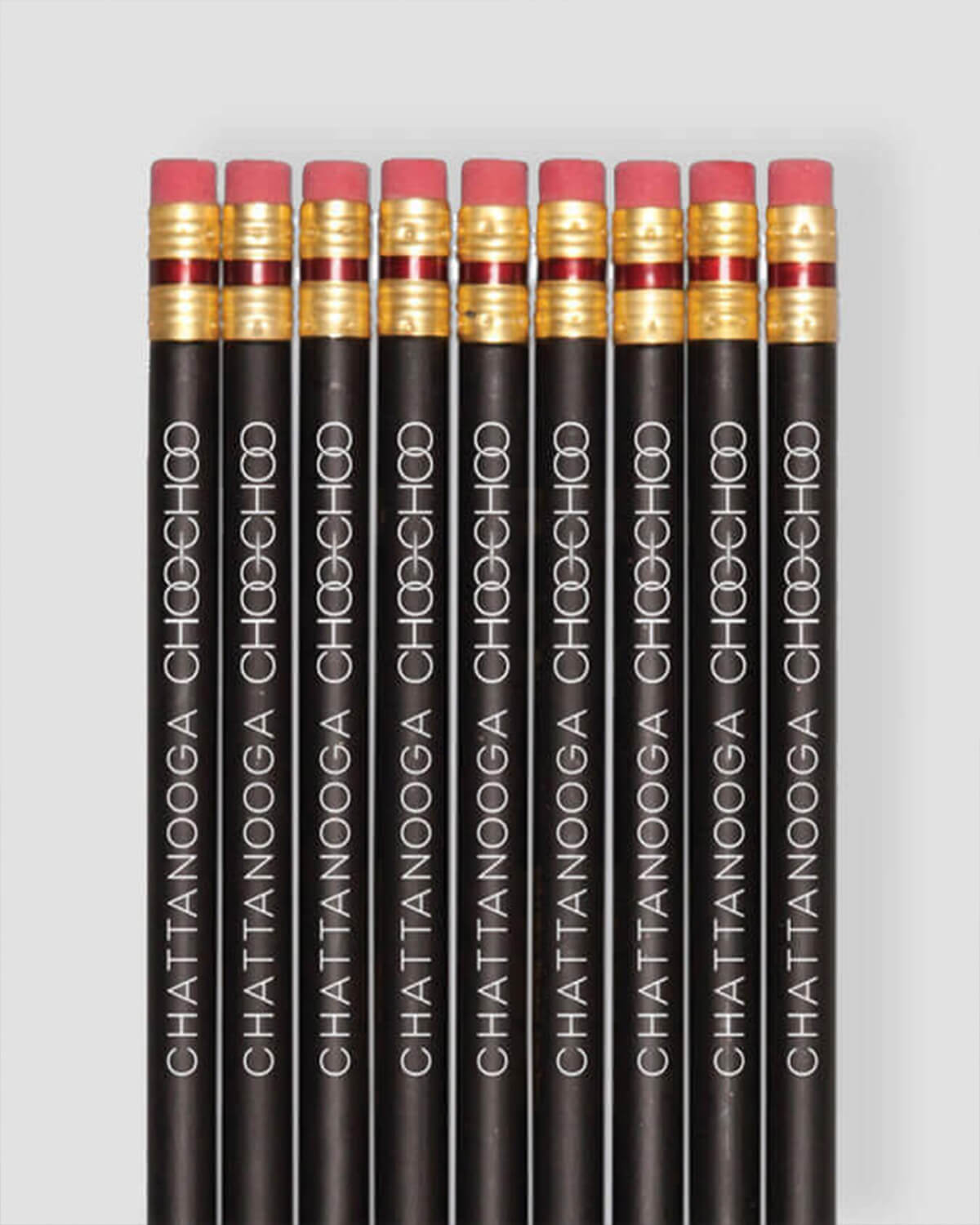
To further update the brand, we brought the new look to stationary, envelopes and business cards, which cleverly resembled a luggage tag. We created t-shirts, which distinctly displayed a look that said the Choo Choo was headed for a new destination. Coffee sleeves carried the new image forward with clever copy and modern looking graphics. We even developed travel journals for guests as a memorable reminder of their visit.
The new look translated well onto baggage tags, door hangers, parking permits, and trolley tickets to the Choo Choo’s on-site music venue, TRACK29. The distinctive graphics and updated typography said changes were on their way, yet history hadn’t left the tracks either.


