Big Rig Lending
Work for this client includes:
Overview
Big Rig Lending provides financial loans on all commercial vehicles: big rig, box or platform trucks, dump trucks, reefers, delivery vehicles, and heavy haulers. As we set out to establish a voice for the brand, our aim was to speak the same language as a group of hardworking individuals who made their living on the road behind the wheel of a 40-ton moving enterprise. And if those individuals weren’t on the road because of a breakdown or a lack of working capital, the enterprise wasn’t making money. Our messaging had to be direct and convincing with an end takeaway that said, when you need money fast, we’ll get it to you in as little as 48 hours, so you can get back to business.
We worked to form a trusted dialogue between Big Rig Lending and long-haul freight drivers. These customers had an immediate need and Big Rig had an immediate solution. The only thing standing between them and the money they needed was 10 minutes, four photos and a mobile transaction that had to be quick and easy to execute.
Logo
The brand identity was bold and assertive, making a statement that this was a company that understood their customer’s need and they needed to respond quickly. The italicized typography provided a sense of motion, suggesting the company was constantly on the move to get the job done. The brand color palette was assumptive. Black combined with orange denoted a sense of strength and commitment.
From the stationary package to the print work to bumper stickers and outdoor, the look and the messaging were consistent. The copy was direct and to-the-point and contained a sense of urgency. Our customers knew Big Rig would be there when they needed them most, come rain or shine.
Advertising
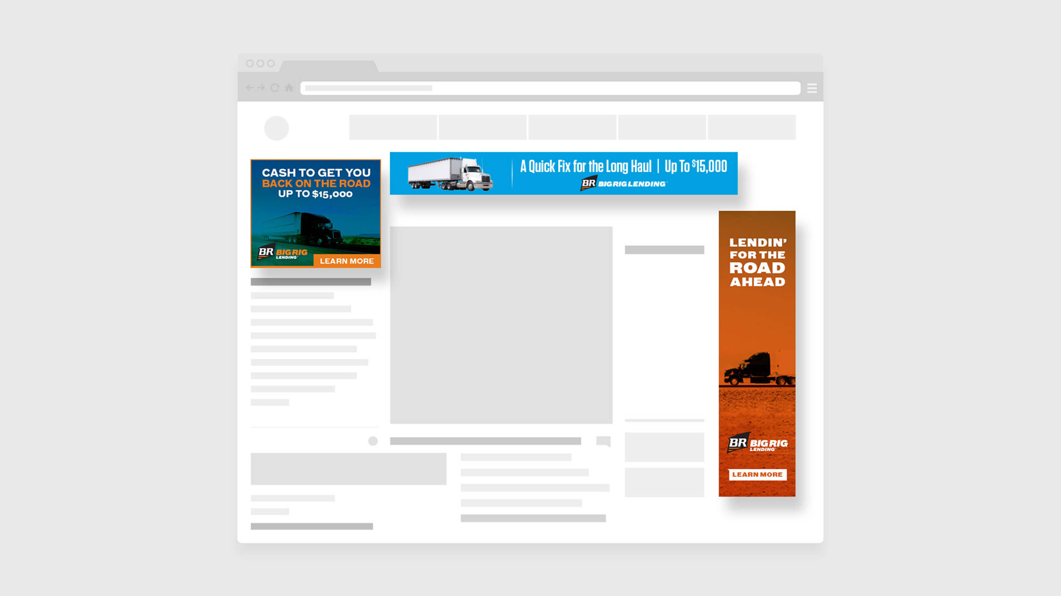
Beyond the bold look, feel and messaging of billboards and print ads, we focused heavily on a digital campaign, targeting key search terms and in-market audiences for customers interested in commercial vehicle title loans and repairs. Potential customers landed on the Get-A-Loan lead generation form and there they were encouraged to complete it and give Big Rig a call. All the actions were tracked by analytics and completing the lead generation form.
Website
The corporate website required a lot of thought from both a design and functionality perspective. It had to be responsive with an easy-to-browse menu, and navigation had to take users to the information they required in one click. In almost every case, drivers would be accessing the site from the road on their mobile devices. They would also utilize their mobile phones to take pictures of their broken-down rigs in order to complete an application for quick funding and approval.