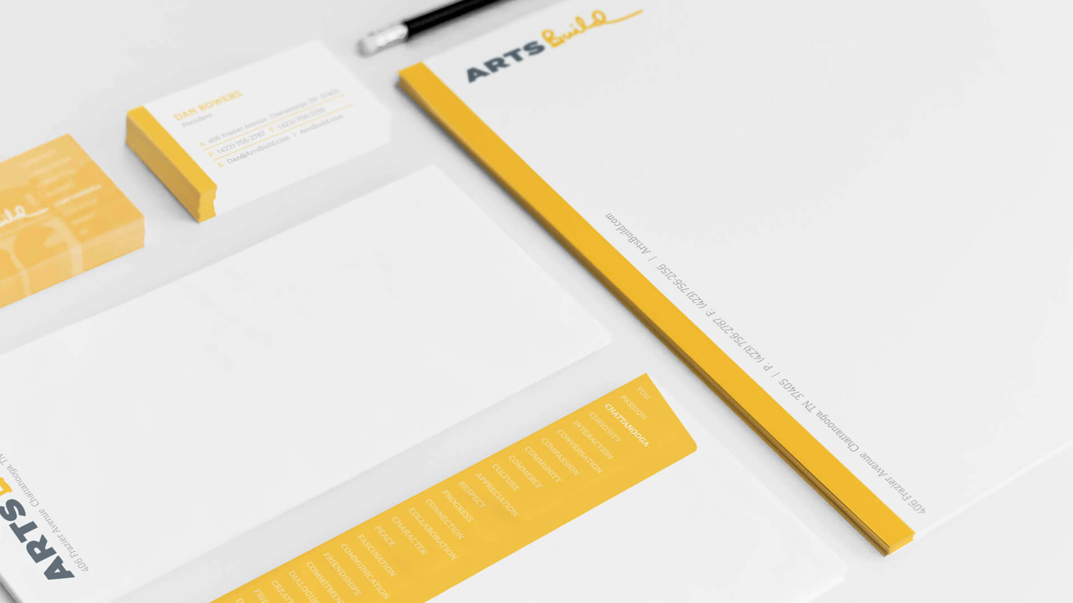
Established in 1969, Allied Arts was a not-for-profit arts council that provided funding and support for several arts and cultural partners, including arts education in the schools. Allied knew it was time they reached out to the larger community. They had to become more relevant to younger donors. Be seen as inclusive vs. exclusive and elitist. It was time for them to contribute to cultural change and bring true value to the community. Lastly, they needed to align with Chattanooga’s increasing national reputation as a creative arts community. Given the magnitude of the project, this was no small task.
It was time for a total rebranding and name change. Our first step? Find a name that redefined Allied Arts. Made it a visible and meaningful part of the community. Raised the organization’s and the city’s profile. And clearly signaled a new beginning.
It was imperative that the new name and look distance Allied Arts from the past, changing current perceptions and projecting a contemporary and timeless brand image. Our immediate goals were to expand our donor base, attract a younger audience, and increase awareness and understanding of the new brand.
It began with finding a new name for the organization. ARTS Build was a big step forward. The name repositioned the brand as one that was moving in new directions. The name defined a brand that was visibly contributing to the community and reaching out to its larger audience with new ideas and commitment.
Color, movement and excitement were a dynamic part of the new look and logo. The handcrafted script that completed the name said this was an organization with a renewed sense of momentum and confidence.


